
Product design, UX, Web
Transaction ledger
Transaction history is one of the most-visited surfaces in any banking product, and one of the hardest to get right across device sizes. I redesigned U.S. Bank’s responsive web transaction ledger for both checking and credit card accounts, modernizing a high-traffic surface that had accumulated years of accessibility debt and inconsistent patterns. This case study focuses on the accessibility and design system work: the decisions we made to meet WCAG standards, improve scannability, and create a component foundation reusable across the broader card servicing portfolio.
Duration
October 2021 – February 2022
Team
- 2 Experience Designers
- Content Designer
- A11Y Consultant
- Product Manager
- Front and backend engineers
- QA testers
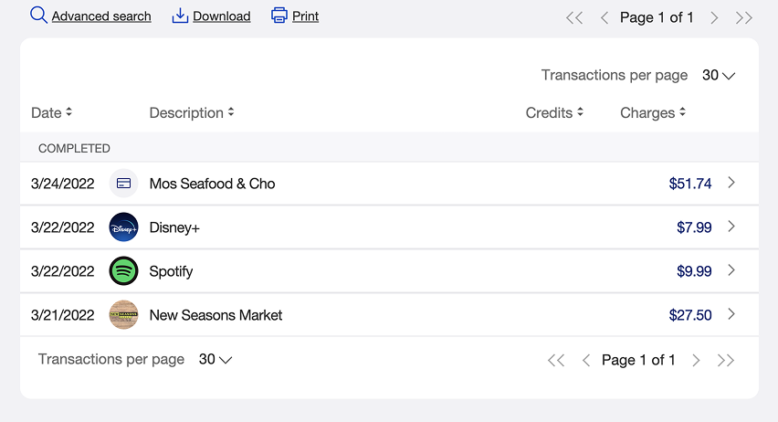
Prior transaction ledger relied on column sort buttons and pagination, making it harder for users to browse and locate recent transactions quickly.
My role
Visual Interaction Designer
- Conducted heuristic evaluation of the existing transaction ledger experience
- Led design discussions for online banking platform enhancements
- Collaborated with stakeholders and subject matter experts, including business line, risk, and accessibility (A11Y) partners
- Delivered prototypes and finalized visual designs to the agile scrum team for development
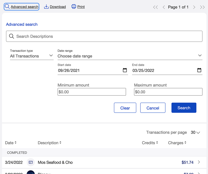
Earlier transaction search interface required users to interpret multiple visible fields, making it unclear how to perform a simple search without entering specific criteria.
Problem
The transaction ledger, one of the most frequently used areas in online banking, had become inconsistent and difficult to navigate. Key functions like search and sort lacked intuitive controls and clear visual indicators.
Users often needed to take extra steps to find or interpret transaction data, particularly on mobile devices. Accessibility reviews also revealed patterns that could hinder users relying on assistive technologies.
Our team saw an opportunity to modernize the experience with minimal disruption to the existing platform, improving clarity, accessibility, and efficiency for users managing their financial activity online.

Legacy transaction ledger displaying four separate column sort dropdowns, creating visual spread and ambiguity around which column was actively sorted.
Goal
Design an updated, accessible, and responsive transaction ledger that:
- Aligns with the design system to ensure consistency across experiences
- Simplifies and clarifies the transaction search and sort interface
- Reduces friction and cognitive load for users on all device breakpoints
- Improves accessibility and usability through refined interaction patterns
Discovery
We began with a heuristic evaluation of the existing web transaction ledger to identify usability and accessibility gaps. This revealed several friction points, including inconsistent data labels, unclear sorting behavior, and pagination patterns that created unnecessary steps for users.
Partnering with an accessibility specialist, we assessed compliance and screen reader behavior across breakpoints. We also conducted a competitive analysis, studying how other banks and fintech platforms approached transaction management, including sort, search, and filter capabilities.
The combined findings gave us a clear view of the improvements needed and where the design system could be extended to support a more inclusive, consistent experience.
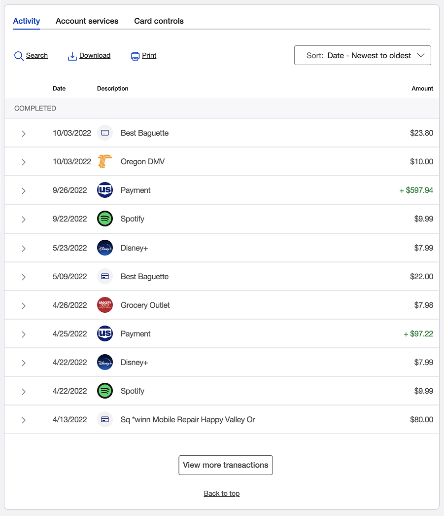
Redesigned transaction ledger consolidating sort options into a single dropdown and replacing pagination with a ‘View more transactions’ button, improving clarity and usability across devices.
Design
With clear priorities in place, I led the design updates for the responsive transaction ledger. Working closely with cross-functional partners including content strategy and accessibility specialists, I created interactive prototypes to support usability testing and stakeholder reviews.
Key improvements included:
- Simplified search parameters with meaningful defaults that reduced initial cognitive load
- Advanced search options contextually nested behind default parameters, creating a cleaner, more focused primary view
- Centralized dropdown control for sorting transactions, replacing column-based sorting and reducing the number of clicks required
- “View more” data fetch mechanism, replacing traditional pagination for a smoother mobile experience
- Refined transaction list items to align with design system patterns, improving visual consistency across the experience
Throughout design and iteration, we ensured all patterns met accessibility standards for color contrast, keyboard navigation, and responsive behavior.
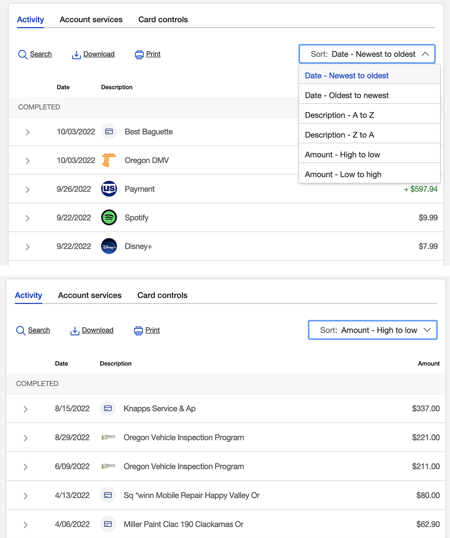
Updated transaction sort design simplifies interaction by combining all sort options into one dropdown and clearly showing which sort is active.
Conclusion
By addressing key friction points in the transaction ledger, our team delivered a more intuitive and accessible experience for customers across devices. The updated design made it easier for users to locate transactions, refine searches, and understand results with fewer interactions. Accessibility improvements met WCAG standards for color contrast, keyboard navigation, and responsive behavior, making the experience more inclusive across assistive technologies and device sizes. Even within the constraints of the existing technology stack, this project demonstrated how small, focused UX and UI enhancements can create meaningful improvements in the customer experience. The goal remains the same: a transaction experience that feels effortless, consistent, and trustworthy, whether users are managing traditional bank accounts or digital assets.
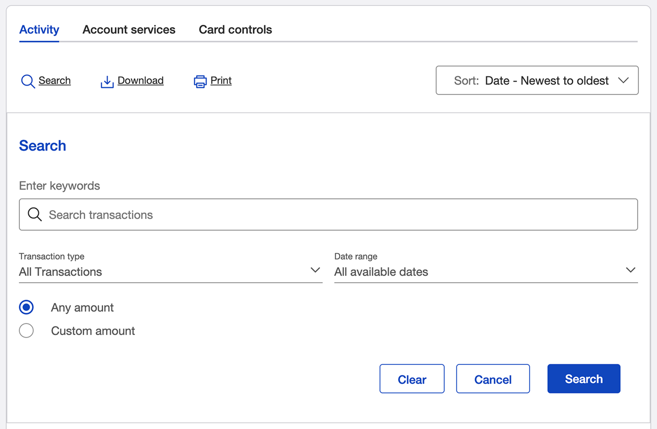
Redesigned transaction search interface consolidates inputs into a simplified layout with clear default parameters, reducing visual complexity and cognitive load.
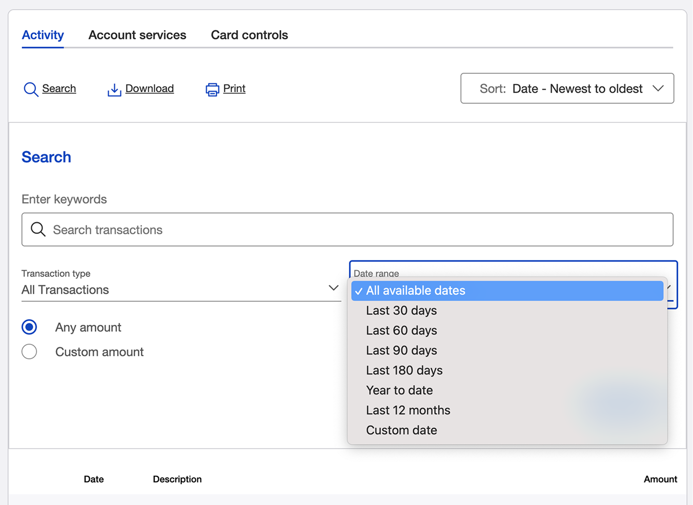
Updated search interface includes an intuitive date range dropdown with preset and custom options, allowing users to quickly refine results.
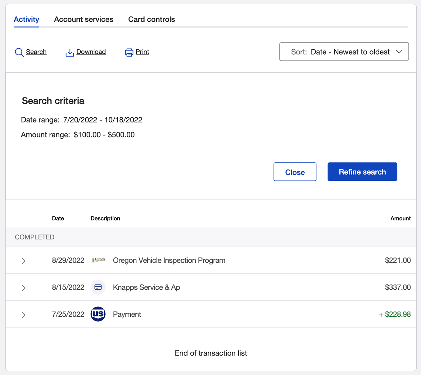
Redesigned search results interface displaying applied filters and clear action buttons for refining or canceling the search.
Reflection
- Consider all breakpoints and assistive devices when designing critical financial interfaces
- Seek opportunities to simplify interaction patterns and reduce steps while maintaining clarity and inclusivity
- Validate that UI content and patterns work across different contexts, since not all configurations behave consistently
- Extend and evolve design system components to ensure they scale effectively across devices and accessibility needs
Would you like to learn more? Contact me and we can have a chat.