
Product design, UX, Web
Credit card upgrade
Millions of U.S. Bank credit card customers had no way to upgrade their card without calling a call center. I led the design of the bank’s first fully digital upgrade experience, taking it from zero to a launched product that delivered strong conversion results and validated the case for expanding the digital upgrade capability further. This case study covers how a cross-functional design sprint, a behavioral science partnership, and a deliberate decision to simplify an inherently complex compliance flow made that possible.
Duration
January 2023 – January 2024
Team
- 2 Experience Designers
- Content Designer
- A11Y Consultant
- Product Manager
- Front and backend engineers
- QA testers
My role
- Led a three-day design sprint to establish the product vision and priorities
- Directed visual and interaction design across responsive web, iOS, and Android platforms
- Collaborated with stakeholders and subject matter experts across business lines, risk, and accessibility
- Guided the team through stakeholder alignment, design reviews, accessibility audits, and risk assessments
- Delivered interactive prototypes and finalized visual designs for agile development
Problem
Credit card users were decreasing their spend because many were enrolled in the wrong card product. These users often had no rewards or rewards that did not fit their lifestyle. Most were unaware that they might qualify for an upgrade to a card better suited to their needs.
Goal
Design the first digital credit card upgrade experience for U.S. Bank that would:
- Clearly communicate each product’s value proposition
- Support customer engagement with relevant card products
- Strengthen customer loyalty and reduce attrition
- Provide a more efficient digital alternative to traditional outreach channels
Discovery
I led a three-day design sprint with participants from product, engineering, design, and subject matter expert teams. We mapped the existing call center process, identified major friction points, and prioritized what to include in the MVP.
Key activities included:
- Defining “How might we” statements
- Conducting competitive analysis
- Establishing personas
- Sketching and storyboarding solution ideas
- MVP value mapping
The group generated many great ideas through the sketching exercise. Knowing we could not execute on every one of these, the value mapping exercise helped to narrow down the scope, while focusing on business and customer priorities. Through this process, the team clarified success metrics and the end-to-end user flow for a digital upgrade experience.
Key decisionUsability testing revealed a gap we hadn’t fully anticipated. Presenting value propositions and benefits for the upgrade offer wasn’t enough to drive confident decision-making. Users struggled to recall what their current card offered, which made it difficult to evaluate whether upgrading made sense for them. Without that context, the offer felt abstract rather than compelling. This finding directly shaped the design direction: rather than presenting the upgrade offer in isolation, we introduced a side-by-side comparison chart showing the customer’s current card benefits alongside the upgrade offer. Giving users the context they needed to make an informed decision, within the flow itself, removed a key point of hesitation and supported the conversion outcome we saw post-launch. The comparison chart finding also informed our broader entry point thinking, reinforcing the importance of surfacing contextual information at the right moment in the customer journey.
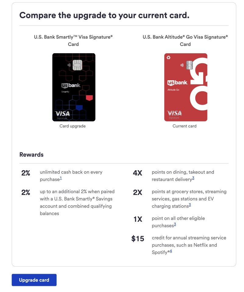
Desktop web experience displaying a side-by-side comparison of the customer’s current card and the new upgrade offer to support informed decision-making.
Design
- Created interactive prototypes for usability testing. Although testing was facilitated by a researcher, I attended sessions to observe user behavior and take notes.
- Led iterative design and content refinement informed by research findings and stakeholder feedback.
- Collaborated closely with marketing, compliance, risk, and accessibility partners to ensure the experience met internal and regulatory standards.
- Ensured visual and interaction consistency with existing U.S. Bank design patterns.
- Developed structured design documentation to support scalable delivery, covering visual assets, legal disclosures, and product value propositions.
- Partnered with the Behavioral Science division to integrate research-backed design principles into the experience, strengthening the behavioral design foundation of the upgrade flow.
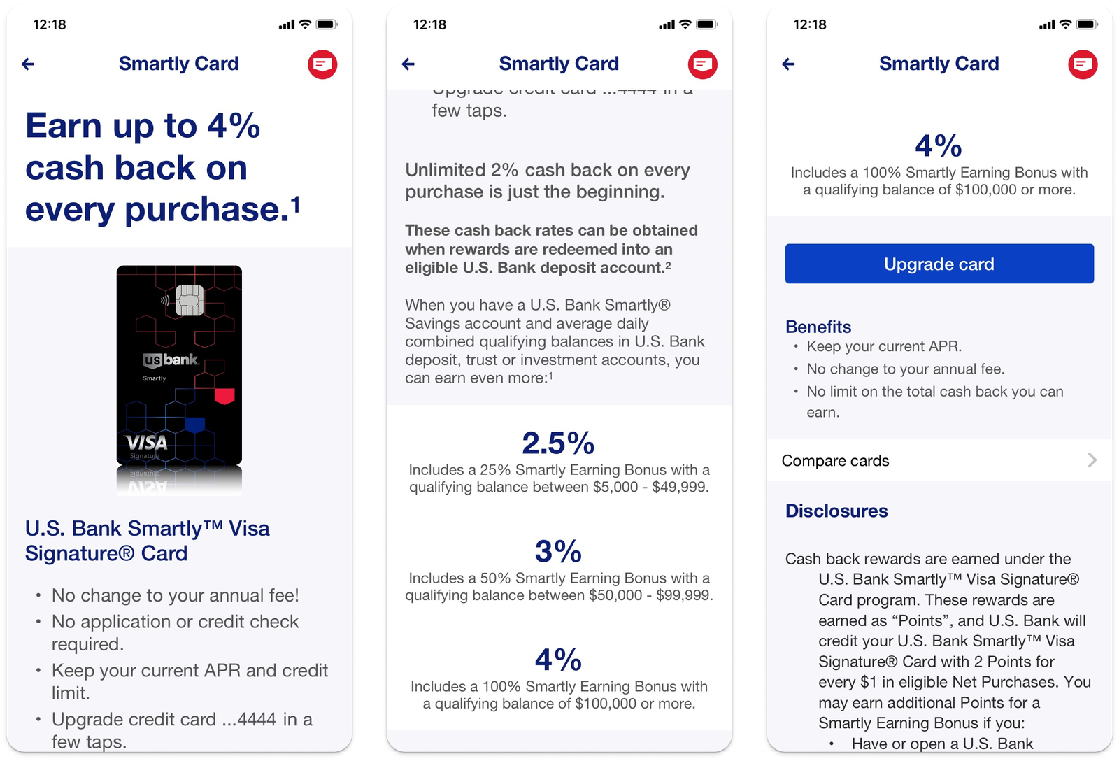
Mobile app screen showing a personalized credit card upgrade offer, highlighting key benefits and rewards details.
Conclusion
We delivered the first digital credit card upgrade capability for U.S. Bank, giving customers a faster, more confident path to upgrading their card entirely online without a phone call. The launch validated that simplifying a compliance-heavy financial decision into a clear, human-centered digital flow is both achievable and impactful. By grounding the design in usability research and behavioral science principles, the experience gave customers the context and confidence they needed to make an informed upgrade decision. The design patterns and approach established through this work informed subsequent card servicing design decisions across the portfolio.
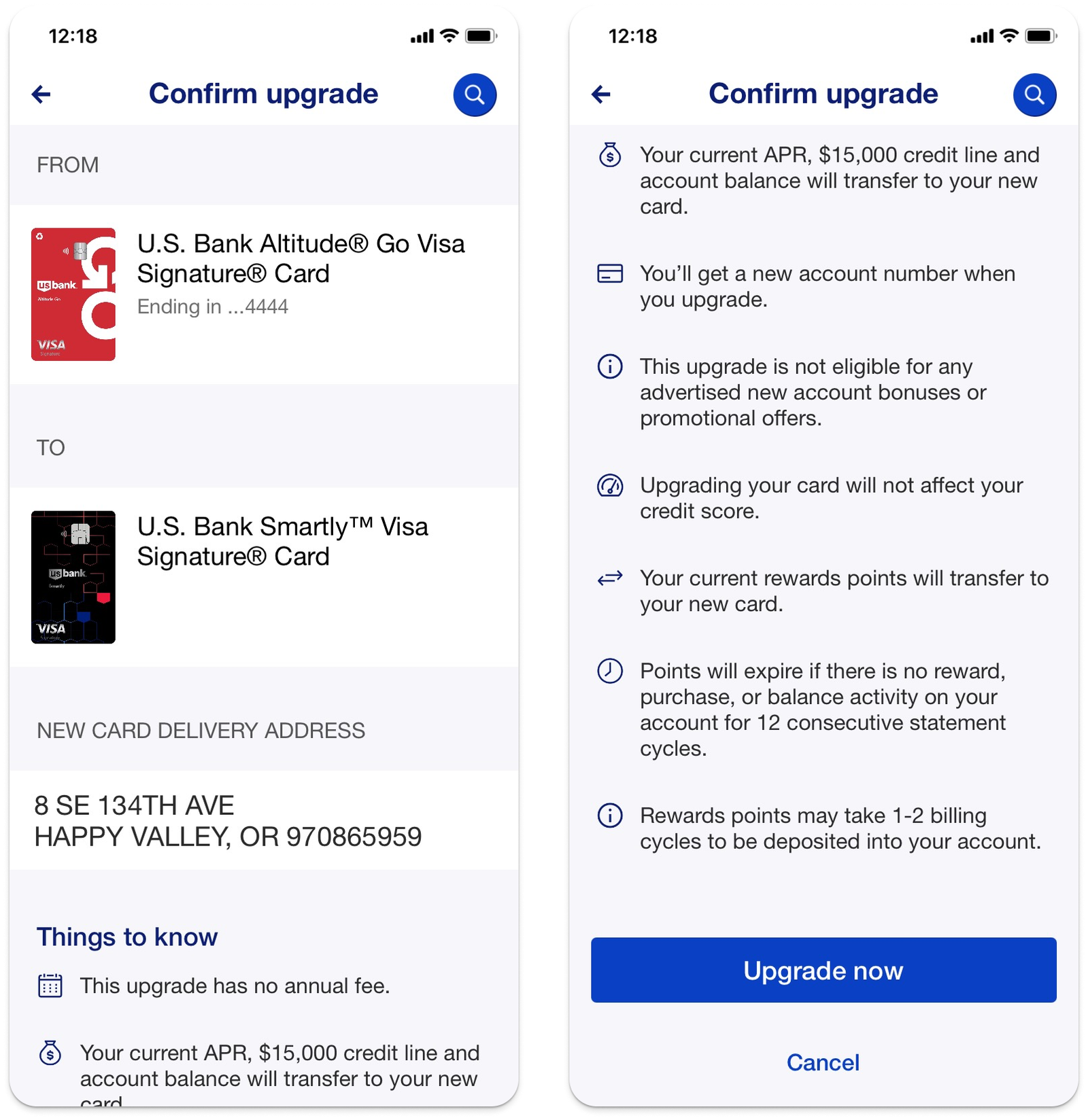
Mobile app confirmation screen where customers review offer details and confirm their credit card upgrade selection.
Would you like to learn more? Contact me and we can have a chat.