
Product design
Manage cards servicing hub
U.S. Bank’s card management features were scattered across multiple entry points, and usability testing confirmed what customers had been experiencing: finding what they needed took too long and caused measurable drop-off. I led the design of a centralized servicing hub that consolidated the bank’s most-used card features into a single, intuitive destination used by millions of consumer and business card customers. By placing the hub entry point in global navigation and adding a CTA from both checking and credit card dashboards, we drove measurable lift in traffic to card servicing features, validating the consolidation strategy and establishing the hub as the foundation for future card servicing work across the portfolio.
Duration
October 2023 – March 2024
Team
- 2 Experience Designers
- Content Designer
- A11Y Consultant
- Product Manager
- Front and backend engineers
- QA testers
My role
- Led visual and interaction design for a responsive web platform
- Collaborated with stakeholders and subject matter experts, including business lines, risk, and accessibility teams
- Guided the team through stakeholder alignment, design reviews, accessibility audits, and risk assessments
- Facilitated team discussions across design, accessibility, and risk domains
- Delivered high-fidelity prototypes and finalized visual designs for agile development
- Led unmoderated usability testing and iterative design improvements
Problem
Usability testing revealed that customers were having difficulty finding where to manage their credit and debit cards. Entry points were scattered across the site, often buried in unintuitive locations. As a result, engagement with key features was low, and many users either missed important self-service tasks or relied on call center support. This created frustration and inefficiency at a critical moment in the customer experience.
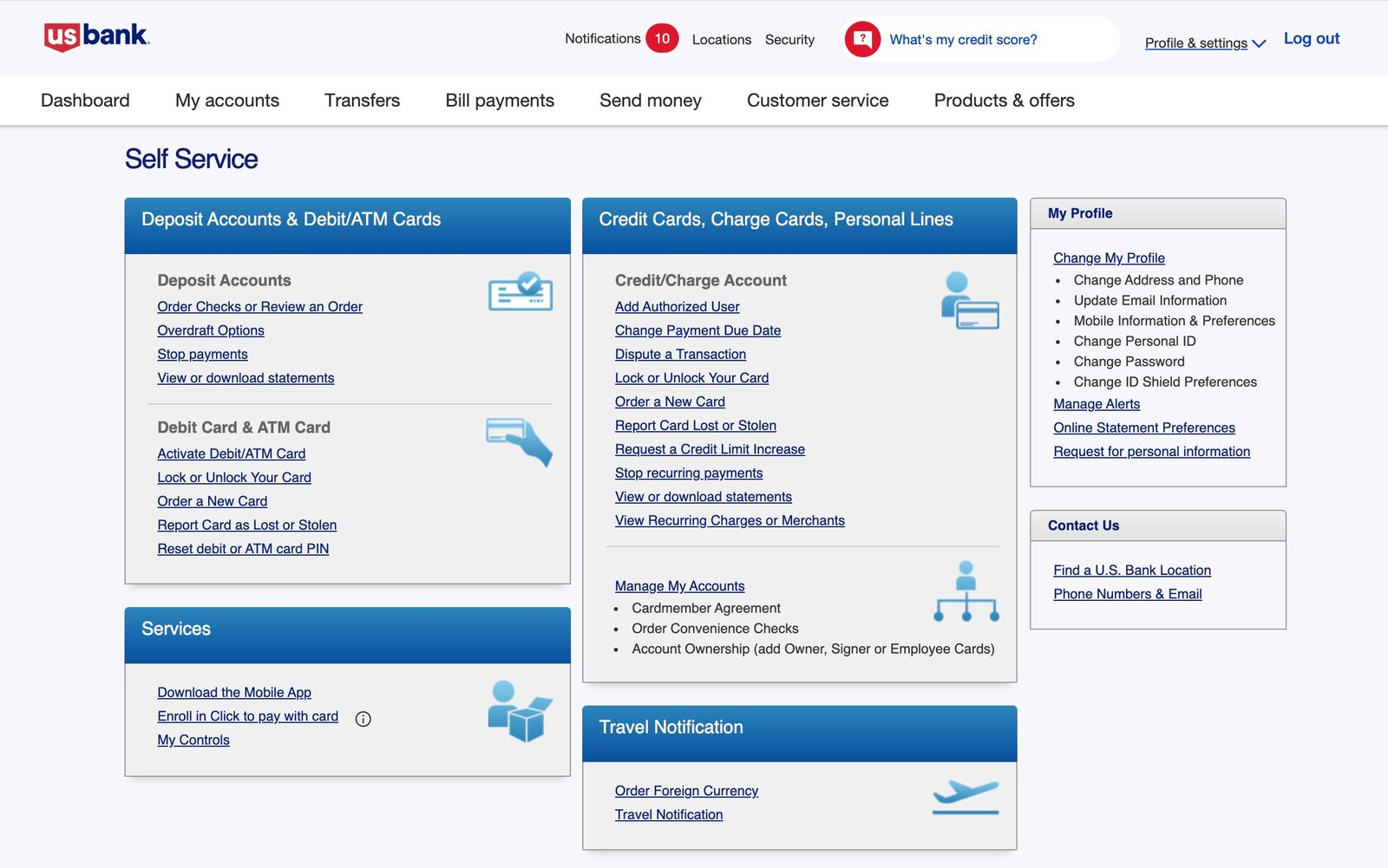
Legacy Self Service screen showing card servicing links mixed with general account management options, lacking clear categorization or context.
Goal
Design a single, centralized “Manage Cards” hub that enables customers to easily access all card servicing features. The solution aimed to:
- Improve feature findability and usage
- Enhance customer satisfaction and confidence in self-service
- Reduce reliance on call center support
- Ensure consistent design across devices and screen sizes
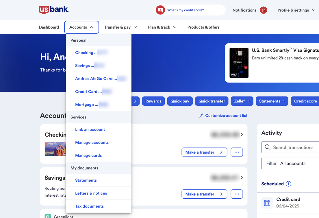
New ‘Manage cards’ link added to the Accounts section of the global navigation, helping users quickly find and access card servicing features.
Discovery
Our time was limited due to deadlines set for web platform updates, so the discovery phase was brief. We began with a “How might we” exercise to frame the problem from multiple angles and generate initial ideas. This exercise brought to light different perspectives and user goals, which eventually guided the overall task flow within the design.
A competitive analysis highlighted industry patterns and potential areas to differentiate the experience. I conducted an exhaustive analysis of existing UI patterns within the Online Banking platform for experience alignment.
We also conducted a content inventory of all existing card servicing links. This revealed a scattered and inconsistent landscape that made it difficult for users to locate essential actions. The findings provided a clear foundation for streamlining navigation and improving task flow.
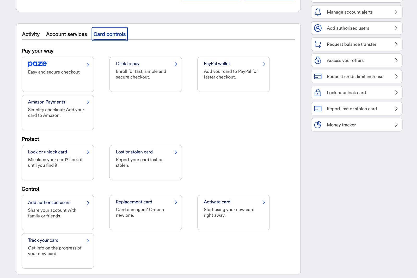
Card servicing links were grouped within a nested tab on the account dashboard, creating a challenging experience for users trying to access key features.
Design
With direction clarified, I created interactive prototypes to visualize the hub and support ongoing UX research. While primarily focused on consumer users, I later designed solutions for small business cardholders, including filters to locate and navigate multiple accounts and cards efficiently.
I assisted with three rounds of unmoderated usability testing, helping to plan sessions. Feedback helped identify friction points and informed targeted design refinements.
Accessibility was integrated throughout the design process. I refined visual hierarchy, interaction details, and content to ensure an inclusive experience. Using our internal design system as a foundation, I extended patterns to accommodate edge cases and new functionality.
I also presented designs during internal critiques and cross-functional reviews, incorporating stakeholder feedback to define a thoughtful MVP and set the stage for future enhancements.
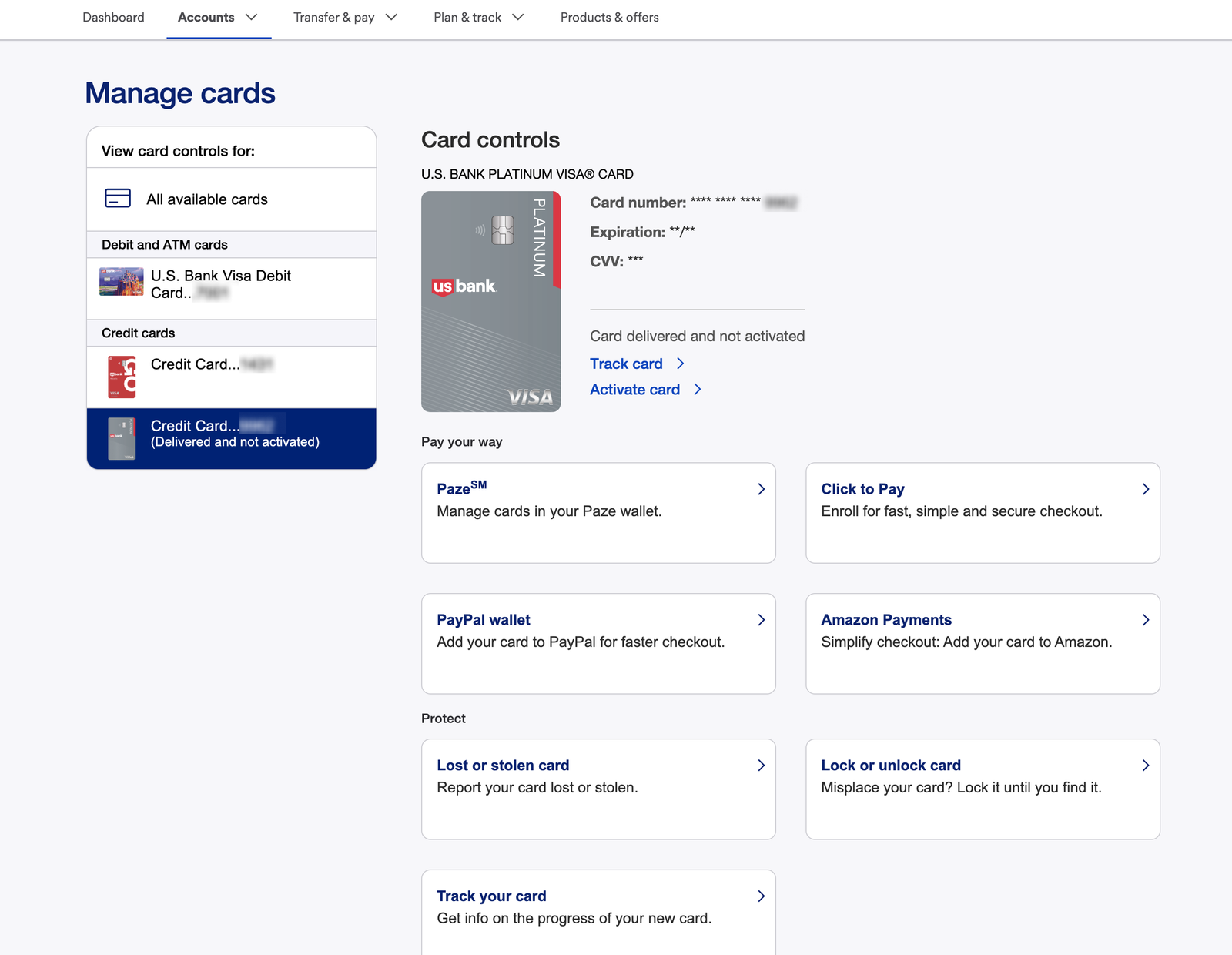
Redesigned Manage Cards interface provides a single hub for all card servicing links, allowing users to navigate by feature or by card to quickly access the tools they need.
Conclusion
The Manage Cards hub launched for consumer and small business cardholders, consolidating card servicing features into a single destination across web and mobile. The centralized experience improved feature findability and gave customers a faster, more confident path to self-service card management. The solution demonstrated that simplifying access and creating a clear, single point of entry could meaningfully improve both usability and engagement. The design patterns developed through this project informed subsequent card servicing work across the portfolio, demonstrating that consolidating access points and simplifying navigation meaningfully improves customer confidence and self-service adoption.
Would you like to learn more? Contact me and we can have a chat.