Product design
Track your card
A new credit card arrives in the mail, but the customer has no idea when, and no way to know if it was lost or delayed. This gap drove a measurable spike in “where is my card” calls to U.S. Bank’s support centers. I led the end-to-end design of a multi-channel card tracking experience spanning web, iOS, Android, email, and push notifications, creating a consistent and timely shipment update system across every touchpoint a customer might use. The NDA note at the bottom covers specific metrics; the process and decisions are documented in full.
Duration
February 2022 – July 2023
Team
- 2 Experience Designers
- Content Designer
- A11Y Consultant
- UX Researcher
- Product Manager
- Front and backend engineers
- QA testers
My role
- Led visual and interaction design across responsive web, iOS, and Android native platforms
- Co-facilitated a one-week design sprint
- Collaborated with stakeholders and subject matter experts, including business lines, risk, and accessibility teams
- Guided the team through stakeholder alignment, design reviews, accessibility audits, and risk assessments
- Delivered interactive prototypes and finalized visual designs for agile development
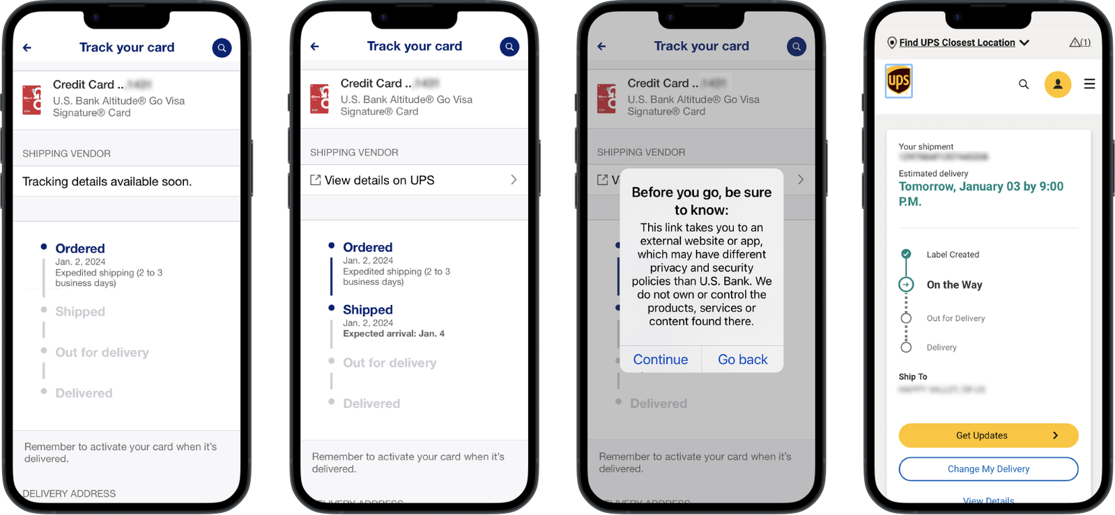
iOS app card shipping flow across four screens: order confirmation, shipment with ‘View details on UPS’ link, external site alert, and UPS tracking page showing the latest delivery information.
Problem
Customers waiting for new or replacement credit cards had limited visibility into shipment status. This uncertainty often led to frustration and unnecessary calls to support. After delivery, many customers delayed or forgot to activate their cards, creating gaps in early usage and engagement. The lack of transparency at this key moment reduced trust and increased friction in the onboarding or card replacement journey.
Goal
Design a clear and reassuring experience that keeps customers informed from shipment to activation. The solution needed to:
- Provide timely updates and clear next steps
- Offer simple self-service options if issues arise
- Enable a smoother onboarding flow and reduce moments of uncertainty
- Maintain consistency across all digital channels and card products
Discovery
We kicked off with a three-day design sprint, bringing together product, engineering, design, and subject matter experts both virtually and in person. This alignment helped clarify priorities and build momentum early.
During the sprint, we:
- Framed the problem with “How might we” questions
- Explored competitor approaches and mapped the current journey to uncover friction points
- Conducted value mapping exercises to identify what mattered most to users and the business
- Ran a Crazy 8’s ideation exercise to generate diverse ideas quickly
- Created storyboards to visualize flows
- Conducted an assumption reversal exercise to challenge existing beliefs and explore new possibilities
By the end of the sprint, we had a clearly defined problem, early concepts to test, and a shared vision for a multi-channel solution.
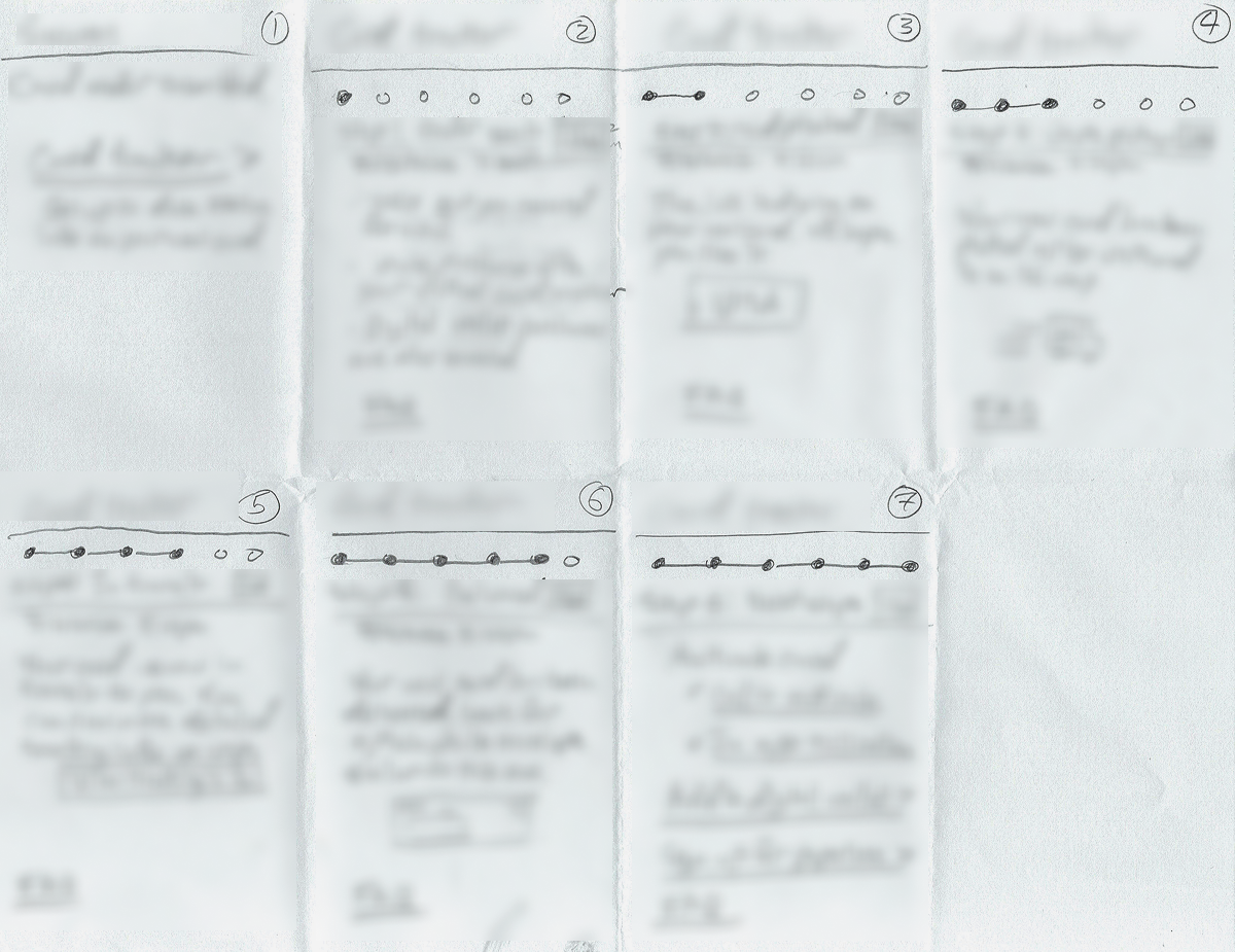
Early sketches exploring how to communicate shipment status across a multi-step progress model. These explorations aligned with the stepped indicator approach used in the final design.
Design
I translated the concepts into a clickable Figma prototype, focusing on the key objectives identified during discovery. Moderated usability sessions with real credit card customers validated the flow and highlighted opportunities to improve clarity and guidance.
Iterations focused on:
- Refining language and entry points to make next steps actionable
- Ensuring the experience worked seamlessly across web, native apps, email, and push notifications
- Extending existing design system patterns to meet feature-specific needs
- Partnering with a content strategist, accessibility lead, and experience architect to address error handling, microcopy, and accessibility requirements
The result was a cohesive, multi-channel experience that helped customers track their cards, complete activation smoothly, and feel informed throughout the journey.
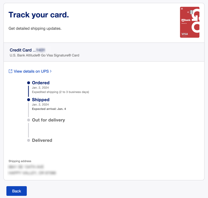
Card tracker on desktop web highlighting the ‘Shipped’ step, providing users with real-time delivery updates and estimated arrival details.
Conclusion
The Card Tracker simplified a previously uncertain moment in the customer journey, giving customers clear visibility into shipment status and consistent guidance through activation. During rollout, we identified that some card products did not require activation, and adjusted the design to ensure all messaging remained accurate for every card type, maintaining trust and clarity across the experience. The project reinforced the value of transparency as a core design principle, demonstrating that proactive communication during key moments in the customer lifecycle measurably reduces uncertainty and support volume. The patterns and standards established through this work informed future card servicing design decisions across the portfolio.
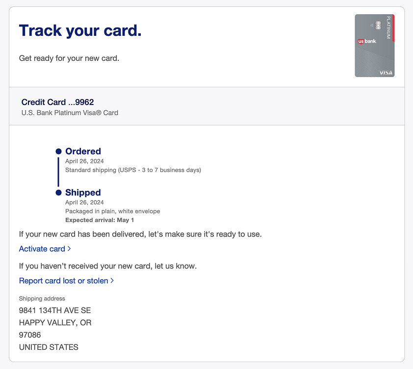
Delivered card screen on desktop web displaying a helpful prompt and direct link to report a card as lost or stolen if it has not been received or activated.
Would you like to learn more? Contact me and we can have a chat.