
Product design
Report cards lost or stolen
Losing a card is stressful. Having to navigate three separate digital flows to report a lost debit card, ATM card, and credit card made it worse. I co-led the design of U.S. Bank’s first unified multi-card reporting experience, bringing all three card types into a single guided journey that reduced customer inquiries and eliminated a long-standing gap in the bank’s digital servicing capability. The project introduced a level of personalization rare for compliance-heavy flows, including debit card art selection to help customers identify the right card quickly.
Duration
February 2022 – July 2023
Team
- 2 UX Designers
- Content strategist
- A11Y consultant
- UX researcher
- Product manager
- Front and backend engineers
- QA testers
My role
- Led visual and interaction design across responsive web, iOS, and Android platforms
- Collaborated with stakeholders and subject matter experts, including business lines, risk, and accessibility teams
- Guided the team through stakeholder alignment, design reviews, accessibility audits, and risk assessments
- Delivered interactive prototypes and finalized visual designs for agile development
- Led usability testing and iterative design refinements
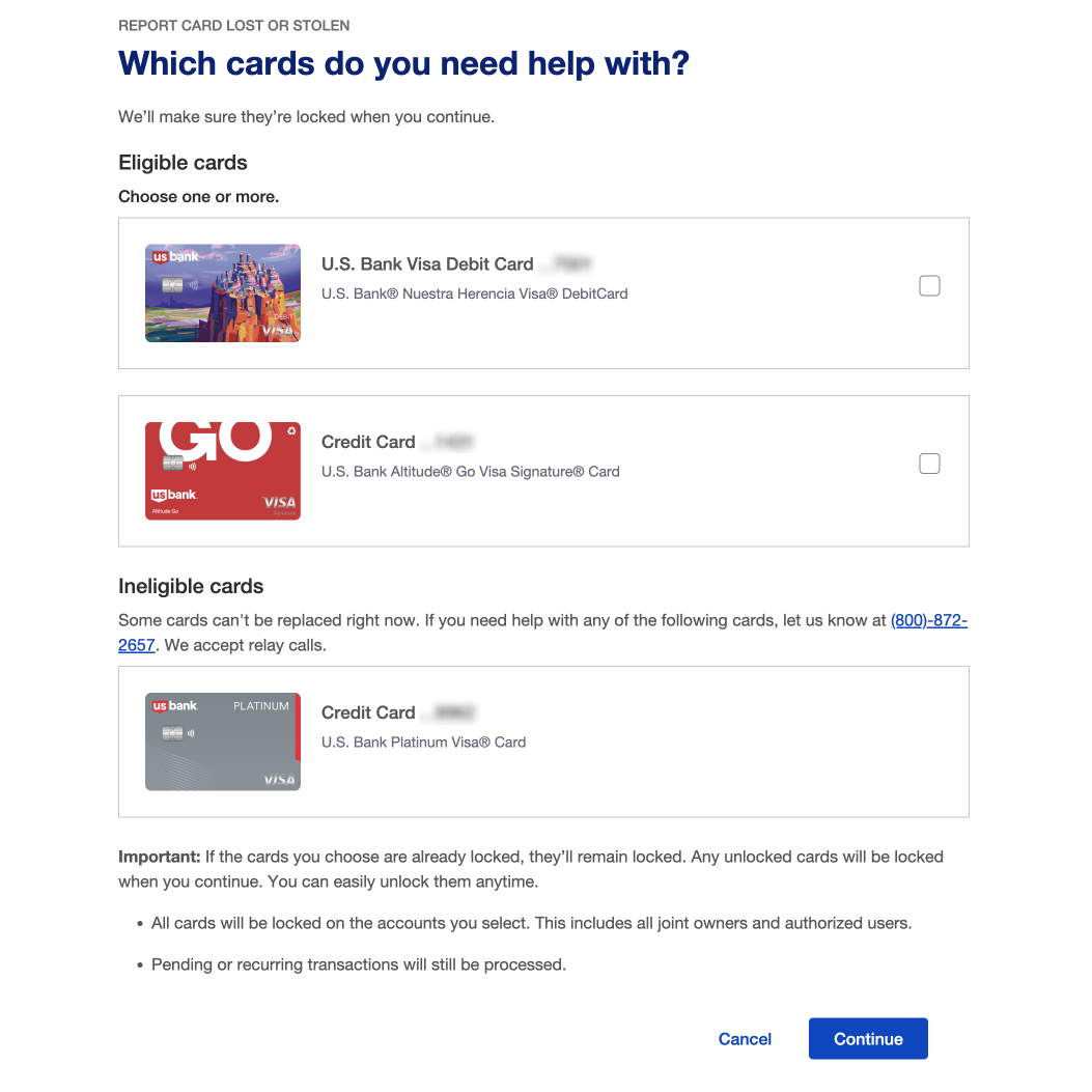
Desktop web card selection interface simplifies reporting by separating eligible cards for action from ineligible cards, reducing user confusion.
Problem
Customers who lost their wallet and needed to report multiple credit, debit, or ATM cards faced a slow, fragmented process. The legacy experience required reporting each card separately or calling support, resulting in frustration and inefficiency.
This high-stress moment created confusion and time delays for users and added operational burden for call center teams. The challenge was to streamline a stressful, multi-step task into a single, cohesive experience.
Goal
Design a unified digital experience that allows customers to report and replace multiple lost or stolen cards in a single flow. The solution aimed to:
- Improve customer satisfaction and confidence in self-service
- Reduce reliance on call center support
- Ensure consistent experience across card types and platforms
- Deliver a seamless, multi-card workflow that works across responsive web, iOS, and Android
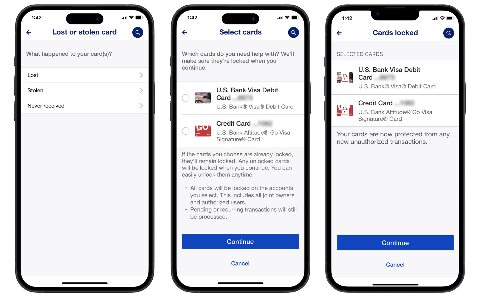
iOS app flow for reporting lost or stolen cards, keeping users informed and secure by clearly guiding them through reason selection, card choice, and temporary card locking.
Discovery
We started with a competitive analysis, which revealed that no other financial institution offered a seamless multi-card reporting experience, highlighting an opportunity to create a first-of-kind workflow. A content audit revealed inconsistencies in messaging, tone, and flow across card types, increasing user friction during an already stressful task. We collaborated with cross-functional partners to understand operational requirements and constraints, ensuring the design would work within existing processes. Discovery findings were synthesized to map the end-to-end customer journey and inform a design approach that balanced user needs with operational requirements.
Design
With direction established, I created interactive prototypes to bring the experience to life and support ongoing UX research. I observed three rounds of usability testing, recording findings and synthesizing insights that informed targeted design improvements.
Key design considerations included:
- Multi-card selection: Allowing users to report multiple cards at once, reducing time and effort
- Accessibility: Ensuring the experience was usable for all customers, including those with disabilities
- Edge cases: Extending existing design patterns to accommodate card-specific scenarios, ensuring a consistent and complete experience across all card types
- Cross-platform consistency: Maintaining alignment across web, iOS, and Android
I also led design critiques and cross-functional reviews, incorporating stakeholder feedback to define and refine a strong MVP.
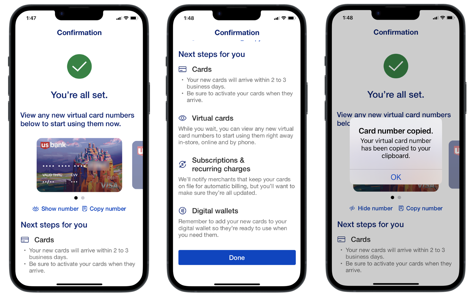
iOS confirmation screens guide users through next steps and offer easy access to view or copy card numbers, ensuring a smooth post-reporting experience.
Conclusion
This update marked a milestone as the first digital experience enabling customers to report multiple lost or stolen cards simultaneously. By unifying workflows across credit, debit, and ATM cards, we turned a fragmented, time-consuming process into a faster, more intuitive one. Iterative refinements, such as redesigning how ineligible cards were displayed, further improved clarity and consistency, highlighting the value of continuous post-launch improvements. The project demonstrated that unifying fragmented workflows into a single guided experience meaningfully reduces friction during high-stress customer moments, and the design patterns established through this work contributed to a broader card servicing design language, informing how complexity and edge cases are handled consistently across the portfolio.
Would you like to learn more? Contact me and we can have a chat.