
Product design
Digital fraud claims
Before this project, every U.S. Bank credit card fraud claim required a phone call, even at 2am when a customer’s card was just compromised. As design lead on a small cross-functional team, I directed the design of the bank’s first fully digital fraud claims experience, working alongside a product designer and a content strategist to bring the end-to-end journey to life. The result gave customers a faster, more trustworthy path to resolution, reducing reliance on phone support for a process that previously had no digital alternative. This case study covers the zero-to-one design process, the high-stakes UX decisions that balanced urgency with compliance, and how we validated the experience before launch.
The challenge
Before this initiative, customers could only report fraud by calling support. Long hold times during large-scale fraud events created frustration and stress for customers who were already dealing with potential financial loss.
The goal
Design a simple, trustworthy, and inclusive digital flow that allowed customers to initiate a fraud claim directly from the web or mobile app without waiting on hold, while still meeting strict compliance and regulatory requirements.
Duration
October 2018 – September 2019
Team
- 2 Experience Designers
- Content Designer
- A11Y Consultant
- UX Researcher
- Product Manager
- Engineers (Frontend and Backend)
- QA testers
My role
As the lead product designer, I:
- Guided the design process from initial sprint through multiple product iterations
- Led alignment with stakeholders across risk, accessibility (A11Y), and business lines
- Partnered with the UX researcher to observe usability testing sessions, capturing user behaviors and feedback that informed design refinements
- Partnered closely with engineers during build and QA to ensure design fidelity
Discovery and Sprint
We began with a design sprint to quickly frame the opportunity. Through “How might we” exercises, Crazy 8s sketching, and storyboarding, we identified a vision for a digital fraud claim experience that felt calm, human, and reassuring.
After the sprint, I analyzed the existing fraud reporting process to uncover dependencies and friction points, identifying opportunities to simplify and humanize the digital experience for customers. These insights informed a simplified, user-centered flow focused on reducing cognitive load during stressful moments.
MVP: Reducing Stress and Call Volume
For the first release, we prioritized impact over complexity. The MVP guided users to the correct fraud assistance path, reducing friction and support volume during a process that had previously required a phone call for every customer. This lean approach allowed the team to validate assumptions, learn from real-world feedback, and build a foundation for the next phase of the experience. In the second phase, we introduced a guided digital claim form designed to feel more conversational than procedural.
I collaborated closely with accessibility and risk partners to ensure the experience remained inclusive, compliant, and aligned with regulatory and policy requirements.
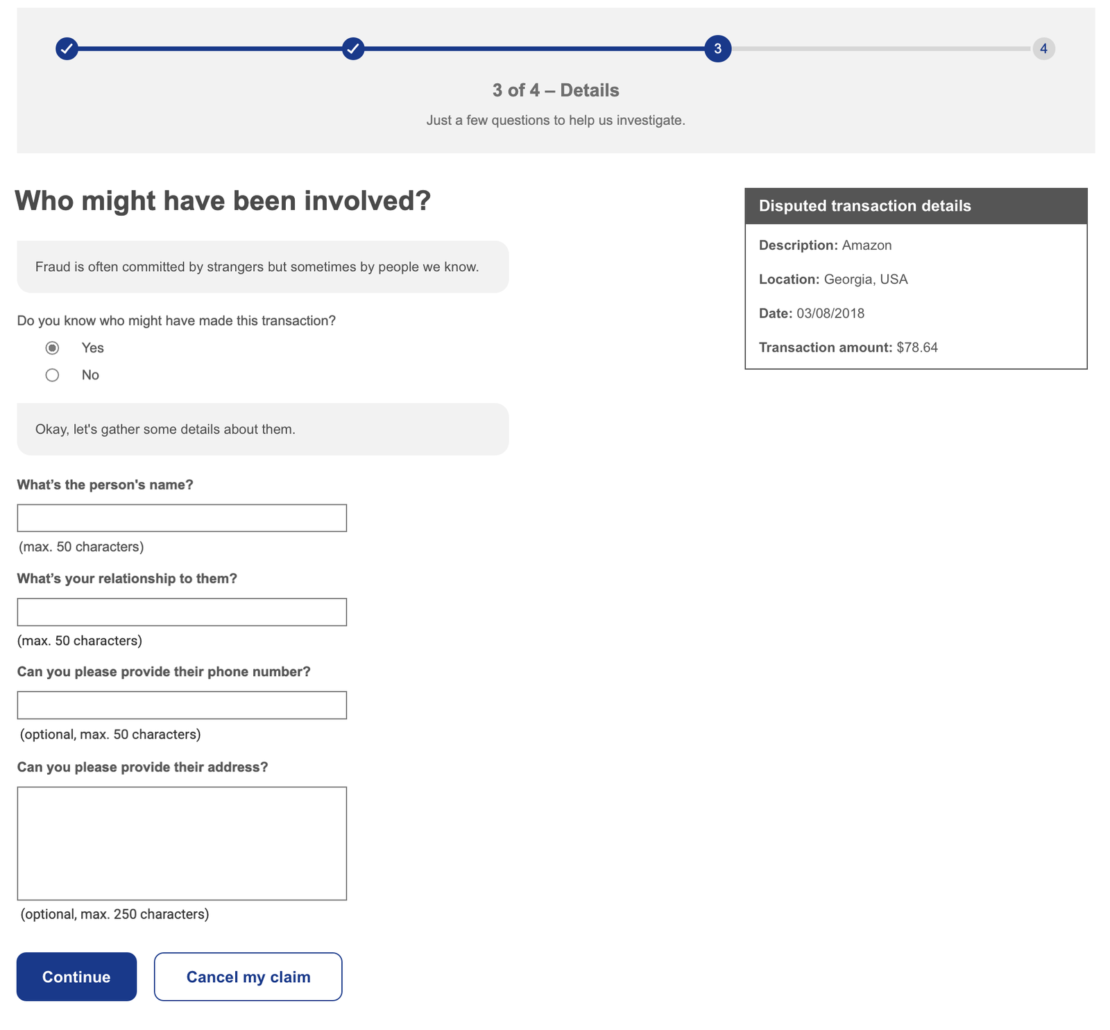
Desktop web view of the guided fraud interview, designed with a conversational tone to reduce user stress during claim submission.
Testing and Refinement
I observed moderated usability sessions conducted by our UX researcher. During these sessions, I noted participant behaviors, confusion points, and moments of friction. These observations directly informed refinements to content, layout, and information hierarchy, helping the flow feel smoother and more reassuring to users.
Results
- First digital fraud claim capability launched across U.S. Bank digital channels
- Customers adopted the self-service option as a faster, more accessible alternative to phone support, reducing friction during a high-stress process
- The conversational tone, clear guidance, and accessible design were well received, validating the approach of leading with empathy in a high-stakes flow
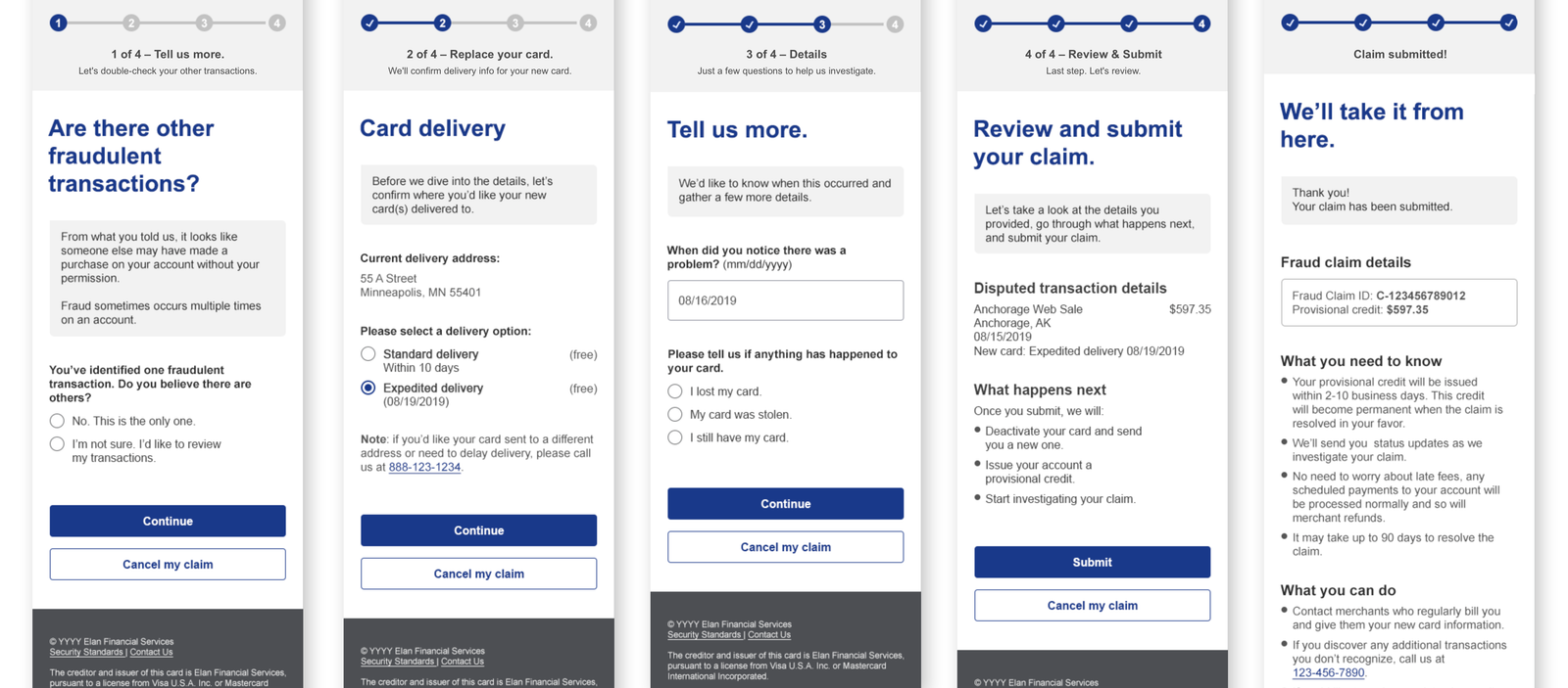
Key screens from the fraud initiation experience, including transaction identification, guided questions, and confirmation steps designed for clarity and empathy.
Conclusion
The Digital Fraud Claims project established that high-stress financial experiences benefit most from a design approach rooted in empathy and clarity. By prioritizing emotional tone alongside functional accuracy, the experience gave customers a trustworthy digital alternative to phone support during one of the most stressful moments in their financial lives. The conversational design patterns developed through this work informed how some subsequent high-stakes flows were approached across the card servicing portfolio.
Would you like to learn more? Contact me and we can have a chat.